UA-15747051-1

Home » Client Work » Recent Articles:

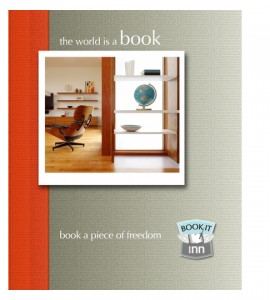
project: Book It Inn pre-press


This is the front cover design for the ‘ Book It Inn’ print brochure. We’re in the midst of doing minor edits to the content and working with the printer on the details of pre-press.

Seen at the bottom right corner, is the logo I designed for this company.
See the post about the logo here.

Check out the print brochure
The content was written by Oriane Delfosse and the images were provided by Daniel Ewald Architecture.

In a few weeks, I’ll build out the website… stay tuned!


………

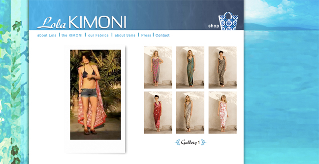
project: Lola Kimoni

This was an especially great client to work with because, not only is she great, her product is gorgeous! “A Kimoni is a little wrap / a little kimono. Like the sari, it’s one rectangular piece of cloth, and comes in one size to fit all.”

The project: Lola wanted to her logo redesigned and needed a brand new brochure website.

Since her product is for warm weather / beach ware, we worked with blue hues throughout the site (and it’s her favorite color!). The background images on the left and right side are “paintings” I created specifically for this project. This kind of customization is what I enjoy the most — although it takes a little more time, the results are well worth it.

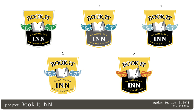
project: Book It Inn Final Logo

This is the final design for the “Book It Inn” logo.

Steps in refining the logo: (1) The shape of the wings  were redrawn because the original drawings looked more like feathers vs. wings.  (2) The color of the wings were going to be colorized but we decided that the final brown-gray outline was a more elegant choice that reflects the kind of brand we’re trying to achieve for this company. (3) The font for the name went through many iterations (tested at least 3 dozen different fonts). We decided the final font would be “Optima,” where we used lower-case “n” for the word “inn” to illustrates arches (a nice detail in architecture).

project: BOOK IT INN Logo, color samples

Version Five: Color Samples

Being a consultant I get the opportunity to learn about different types of businesses. During this present recession, one business in particular that peaked my interest is real estate.

As in any recession, businesses have to come up with creative ways to survive a slow economy. Fractional Ownership – a percentage share of an expensive asset (like real estate) – benefit entrepreneurs during times like these. (By the way, Fractional Ownerships are not timeshares…)

My new client project, Book It Inn, is a start-up, where my clients have been independent real estate consultants for 30 plus years. Their business has two parts: To transform properties into Fractional Ownership Real Estate, and to manage and promote these properties for short-term vacation and private events.

This startup project includes: coming up with a name for the new company, brand and marketing images and strategy, website, blog, book and (later) a mobile app.

Phase One: Brand Development

For the first phase of this project I was asked to create a name brand and image. The first two general considerations in naming and designing the brand: demographics and trends.

Being that this business will be targeted to less conservative real estate investors, and to renters that are hip to alternative choices (like Bed and Breakfast Inns), the name and brand had to speak to both perspectives. Also, as the trend now is to book your vacation details online, a snappy and easily understood message should be the name of the company.

Combining the idea of B&Bs, the trend of online booking and the terminology for “book it,” meaning to do it fast, the name Book It Inn was born.

The tagline: “The world is a book, book a piece of freedom,” was inspired by a famous travel quote by Saint Augustine — “The World is a book, and those who do not travel read only a page.”

The double meaning of the wings representing travel for the vacationer, and freedom for the real estate investor that may feel captive by this economy (or simply wants to spread their wings with alternative business strategies), works well in this brand. Additionally, the business message is to relay a more personalized service that reflects an old-time feeling of reliability and comfort.

Stay tuned for the next phase, the website and book.

___________________________
project: SANCHEZ STREET STUDIOS

August 25, 2010 Client Work No Comments

.

About ten years ago, I had designed the logo and business cards for Sanchez Street Studios. Last week, Carol, the founder of SSS, called about a print project — a new vinyl sticker for the front door of the studio (result on the far right).

It was fun working on an image that I had designed in the past, as well as working on a big format project (large print and sculpture installations are especially fun projects as you get to see how your piece interacts with the surrounding elements). The project: I created an Illustrator document per the the door’s dimensions (29 inches x 53 inches) and redrew the logo (both she and I had misplaced the original file). Go check out the end results at 1589 Sanchez St. @ 29th in San Francisco’s Noe Valley… while you’re at it, take a class! The two-level studio with mat / ball classes downstairs and reformer classes / private sessions upstairs, is a welcoming and cheery space.

___________________________

Pages

AdvertisementAdvertisementAdvertisementAdvertisement

Prints, Postcards, T-shirts, Stickers …

Creative Commons Copyright License

The work on this site is copyrighted by me or the perspective client. You can share the imagery or content from this website after you (1) email and ask me via (diana@artefacts.us) and, (2) mention this website (eyeblog.artefacts.us).

To read in full about the "Creative Commons Copyright License," please copy and paste the below link into a new browser to see the details. Thank you.

http://creativecommons.org/licenses/by-nc-nd/3.0/legalcode

Thanks!